As you have noticed, I’m not posting very often on this blog anymore.  My schedule and my focus have shifted.  I’m spending more time traveling, teaching and painting in the studio.

Dip Pens in a Goya Tin

Dip Pens in a Goya Tin

Please remember that most of my blog posting will be done on my website blog rather than here or on my Third Time Around Blog.  Please subscribe to the website blog and/or the monthly newsletter if you want to continue to follow my adventures and musings.  Link to Website Blog …… Thanks!

Image: Dip Pens in Goya Tin, drawn first in ink with fountain pen, followed by watercolor washes, Color Scheme- Analogous with Split Complements.

Lately I have been heading straight to the studio to work on my Orb and Energy paintings.  Occasionally, I took a break and sketched a few culinary herbs.  This morning, I felt the need to sketch from my bed while sipping coffee and to throw the die for a color scheme.  Being so distracted lately, my dresser has accumulated an odd collection of objects.

Cluttered-dresser-ink-watercolor-sketchbook-drawings-chris-carter-artist-071713-web

Cluttered Dresser (4.25″ x 6.25″)

…. a bottle of lavender lotion to help me sleep at night, a small vial of patchouli oil, eye drops, ear buds, an insect repellent wristband ( works quite well!), a light bulb and a thin tape measure…..

This is where my painting energy has been going lately…..

Crack of Dawn, Orbs No. 9

Crack of Dawn, Orbs No. 9 (21″ x 14″)

And….. not that I need to be involved with another blog! Oh no!…. I’m trying to cut back on my blog time…. But, I can’t resist the invitation from an old and dear friend to put our minds together to create a blog that explores both the working of the brain and the mysteries of the Universe.  I have wanted to tap into the world of artists who love science and this is the first step to finding that community!   Of course…. I will be posting many of my orb paintings on the new blog.  I’ll keep you posted.

Cluttered Dresser: drawn first with ink using a fountain pen, followed by watercolor. Analogous with split complemens color scheme.

Crack of Dawn, Orbs No. 9: Watercolor, layered and layered and layer even more… thrown, splattered, blown, etc.

(1. ) Matted, framed and dropped off paintings for solo exhibit at Connexions Gallery in Easton, PA …. done  (2.) Picked up paintings from exhibit in Brooklyn … one sold! …. done (3.) Figure out how to film, edit and post short art videos for my students …. still a long way to go to get better, but done.  The list goes on.  Fortunately, all but a few items on the current Art Business list are checked off.  Today the list will grow again, but last night I felt the pressure was off.  I laugh when people envy my life as an artist thinking that I have all the time in the world to do exactly what I want to do.  My life as an artist definitely is enviable, but not for that reason.

Pete's Angel playing to a lame audience

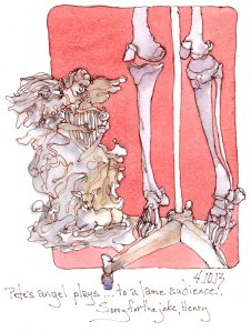
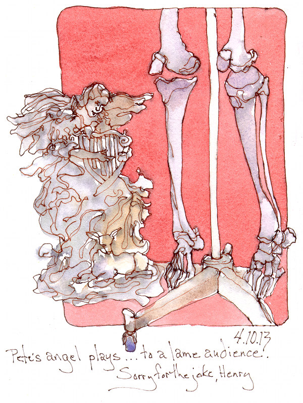
Pete’s Angel playing to a lame audience

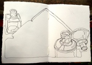
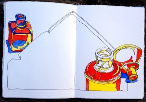
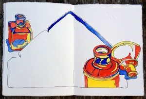
What might be envied is the joy of curling up in a comfy chair, a warm breeze crossing the room, the sound of gentle rain with an occasional flash of lightning, fountain pen in hand, drawing two of my constant companions, the little garden angel given to me by my friend, Pete, and my skeleton, Henry.  They keep each other company beside the fireplace in the living room.

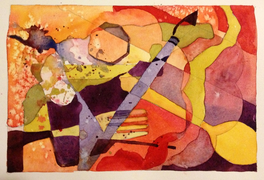
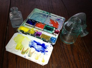
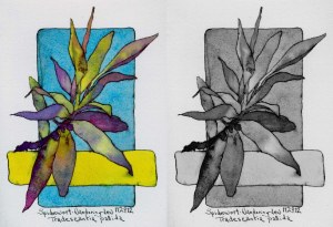
Why post this random though on Creative Color?  Because I am still exploring the beauty of the neutrals I can achieve with that ugly pigment, Cadmium Red Deep!  I began my intense study of color three, almost four years ago so that I could bring more full intensity, highly saturated color into my paintings.  That mission has been accomplished and I am enjoying full intensity hues more than I imagined possible.  Now I am going deeper into the world of beautiful color and playing with neutrals.  Without realizing it, most of my daily sketchbook paintings, though rich in color and value, do not use any of the three pigments in full intensity.  All of the colors applied to the drawing are mixes of all three primary pigments in my limited palette of raw sienna, cadmium red deep and ultramarine blue.  This is my third week exploring this palette and I like it more each day.  Though I’m excited about whatever my next three primaries might be, I can’t seem to leave this palette behind.

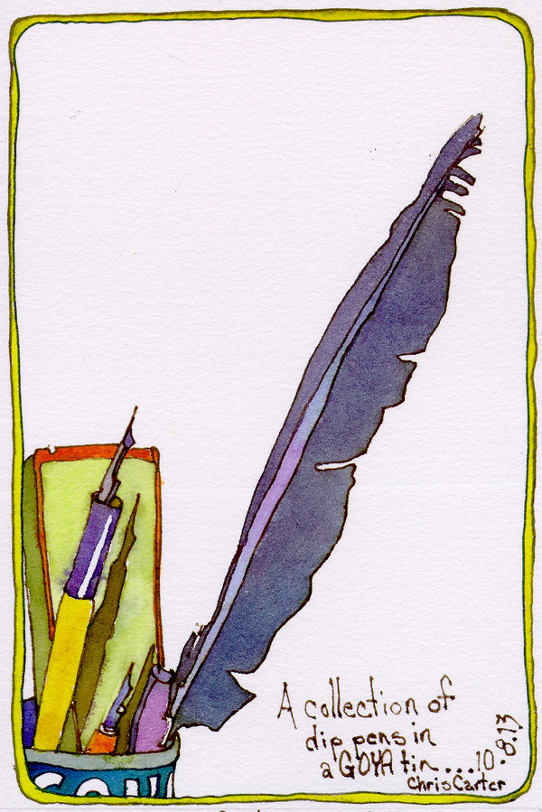
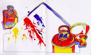
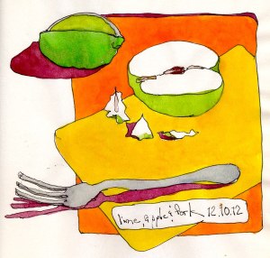
Image:  Drawn first in ink with fountain pen, followed by watercolor.

For those of you who live within driving distance of Santa Rosa, California …. I will be teaching workshops at both Village Art Supply (April 25th & 26th) and Riley Street Art Supply (April 27th & 28th)  Please contact me if you would like more info!

Link to short art videos:  Vimeo.com/ChrisCarterArt/

Link to Website Blog: ChrisCarterArt.com/blog/

Bring The Color Scheme Game outdoors, even in the winter.

Fire Hydrant on Haywood Road, Asheville, NC

Fire Hydrant, Haywood Rd, Asheville, NC

When filming one of the videos, Twenty Steps to Better Drawing, for the upcoming series of online painting demos, I found myself beside this fire hydrant after my third round of twenty steps.  The fire hydrant wasn’t yellow.  It was a fabulous combination of bright blue, red and green.  For a quick application of color, I opted to use a limited palette with a basic color scheme of Near Complements, Yellow and Red/Violet. I wanted to make a strong statement using the extremes of color value. Reality doesn’t matter to me.

Sketchbook, en plein air sketch: Fire Hydrant on Haywood Road, Asheville, NC – drawn first in ink with a fountain pen, followed by washes of watercolor.  The sketchbook is a moleskin sketchbook with slippery paper surface.

When teaching workshops focused on a variety of watercolor techniques, I present the students with a project that allows for experimentation and encourages a playful, curious attitude.

Abstraction From Traced Objects

Abstraction From Traced Objects

Why don’t I set up a lovely still life for the students to work from?  Because a still life requires drawing skills that many students have not yet acquired.  By the time the students are ready to add paint to their drawings, half the class is over and the students are already discouraged.  The poor results are blamed on watercolor being a difficult medium.

One cannot be either good nor bad at tracing objects.  By placing and tracing objects in a variety of positions on the paper, numerous overlapping shapes are created from which the students can easily extract an abstract design.  Within half an hour the students are still excited about painting and are ready to begin the adventure of playing with watercolor.

On January 14th I will present this exercise on the “Tools and Techniques” blog of my website.  This is just a sneak preview.

Sketchbook Image:  Watercolor  illustrating various watercolor techniques – Wash, glaze, splatter, adding salt, lifting, and wet in wet.

Color Scheme:  Extended Analogous with one complement

Color schemes have become another fine-tuned skill in my toolbox.  As with any tool, a lifetime can be spent learning new uses for tools.

Photo of Glass Inkwells and Travel Palette

Photo of Glass Inkwells and Travel Palette

Unexpected possibilities now present themselves during my morning practice of the Color Scheme Game.

Line Drawing

Line Drawing

Normally, I would continue the line drawing adding the pans of watercolor and the indications of the mixing wells.  At this point, I stopped.  There was something about the large, open shape of the palette without details that I liked.  It gave contrast to the smaller shapes that describe the inkwells.

Painting in the Inkwells

Painting in the Inkwells

I decided to throw the die and paint in only the inkwells leaving me the option of drawing the pans of pigment before painting the palette shape.  I came up with the Basic Triad Color Scheme with red as one of the colors.

Glass-Inkwells-18-Watercolor-Travel-Palette-primary-triad-color-schemes-Chris-Carter-Artist-121512b-web

One more step

I went one step further to paint the inside lip of the travel palette.  I put the drawing aside until the next morning to see if I felt the same way about it.  In the middle of the night I awoke with the idea of indicating the paint in the palette as splats rather than pans of pigment.

Glass-Inkwells-Watercolor-Travel-Palette-primary-triad-color-schemes-Chris-Carter-Artist-121512webs

Glass Inkwells No.18 with pigment splats

I’m pleased with the results and glad that I allowed for something new to happen.

Sketchbook Drawing: Glass Inkwells No. 18, Ink and Watercolor. Drawn first with fountain pen filled with Noodler’s Black ink followed by watercolor.

Color Scheme: Basic Triad of yellow, red and blue.

Limite palette: Cadmium Yellow Pale, Cadmium Red Light, French Ultramarine Blue

When Tom is away, meals don’t happen. While I baked cookies, Deb came to the rescue and prepared dinner.

Lime, Apple and Fork

Lime, Apple and Fork

Sketchbook drawing: Lime, Apple and Fork – Drawn first with fountain pen filled with Noodler’s Black ink, followed by watercolor.

Color Scheme: Analogous with one complement (Yellow-Orange, Yellow, Yellow-Green and Red-Violet) The fork is a neutral gray.

Limited Palette: Cadmium Yellow Pale, Aureolin, Cadmium Red, Permanent Aliazrin Crimson, French Ultramarine Blue

Last night while making cookie dough I created the samples for Exercise No. 1 on my website blog. Check it out!

Eggs in Cardboard Carton

Eggs in Cardboard Carton

The goal is to draw, draw, draw, without concern about the drawing being masterful.  This exercise will strengthen eye/hand coordination.  The foundation of a strong painting is strong drawing skills whether the work is realistic or abstract.

Sketchbook Drawing: Eggs in Cardboard Carton – drawn in three minutes with a fountain pen before breaking the eggs and adding them to the cookie dough batter.

Painting by color value does not always need to result in high contrast paintings.

Comparing Full Color to Grayscale Mode

Though there are extreme darks and a few strong lights, the overall feeling of the painting is more of a mid range contrast of values.  The leaves don’t contrast strongly against the background.  When violets are part of the adjacent colors, an extended analogous with one complement color scheme  provides an excellent selection of hues for any value range (High, mid or low contrast) even when painting with full saturation colors.

Spiderwort, Wandering Jew
Tradescantia Pallida

Sketchbook Drawing:  Spiderwort, Wandering Jew, Tradescantia Pallida – drawn first with fountain pen followed by watercolor.

Limited palette:  Aureolin, Permanent Alizarin, French Ultramarine Blue, Manganese Blue and a touch of Cerulean.

My pressed clipping from a Red Tip Photinia long ago lost it’s brilliant color.

Pressed,dried, Red Tip Photinia clipping

The last couple of days I have painted samples of Color Value Painting, choosing hue according to its intrinsic value at full saturation rather than choosing hue according to the color of the object I am painting.  I want to show an example of completely arbitrary hue choices but I couldn’t bring myself to place full saturation red next to full saturation green.  Instead, I stayed with the left side of the color hue/value diamond.

Color hue/value

If it didn’t take so long to do the drawing, I would do another painting of the Red Tip Photinia using the right side of the diamond.

Comparing Full Color to Grayscale Mode

Sketchbook Drawing:  Pressed, Dried Red Tip Photinia – drawn first with pencil, followed by watercolor.

Limited Palette: Aureolin, French Ultramarine Blue and Permanent Alizarin (all Winsor Newton watercolor tube paints)