Painting by color value does not always need to result in high contrast paintings.
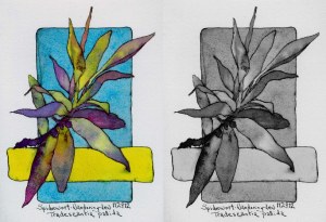
Comparing Full Color to Grayscale Mode
Though there are extreme darks and a few strong lights, the overall feeling of the painting is more of a mid range contrast of values. The leaves don’t contrast strongly against the background. When violets are part of the adjacent colors, an extended analogous with one complement color scheme provides an excellent selection of hues for any value range (High, mid or low contrast) even when painting with full saturation colors.

Spiderwort, Wandering Jew
Tradescantia Pallida
Sketchbook Drawing: Spiderwort, Wandering Jew, Tradescantia Pallida – drawn first with fountain pen followed by watercolor.
Limited palette: Aureolin, Permanent Alizarin, French Ultramarine Blue, Manganese Blue and a touch of Cerulean.


