Painting by color value does not always need to result in high contrast paintings.

Comparing Full Color to Grayscale Mode

Though there are extreme darks and a few strong lights, the overall feeling of the painting is more of a mid range contrast of values.  The leaves don’t contrast strongly against the background.  When violets are part of the adjacent colors, an extended analogous with one complement color scheme  provides an excellent selection of hues for any value range (High, mid or low contrast) even when painting with full saturation colors.

Spiderwort, Wandering Jew
Tradescantia Pallida

Sketchbook Drawing:  Spiderwort, Wandering Jew, Tradescantia Pallida – drawn first with fountain pen followed by watercolor.

Limited palette:  Aureolin, Permanent Alizarin, French Ultramarine Blue, Manganese Blue and a touch of Cerulean.

My pressed clipping from a Red Tip Photinia long ago lost it’s brilliant color.

Pressed,dried, Red Tip Photinia clipping

The last couple of days I have painted samples of Color Value Painting, choosing hue according to its intrinsic value at full saturation rather than choosing hue according to the color of the object I am painting.  I want to show an example of completely arbitrary hue choices but I couldn’t bring myself to place full saturation red next to full saturation green.  Instead, I stayed with the left side of the color hue/value diamond.

Color hue/value

If it didn’t take so long to do the drawing, I would do another painting of the Red Tip Photinia using the right side of the diamond.

Comparing Full Color to Grayscale Mode

Sketchbook Drawing:  Pressed, Dried Red Tip Photinia – drawn first with pencil, followed by watercolor.

Limited Palette: Aureolin, French Ultramarine Blue and Permanent Alizarin (all Winsor Newton watercolor tube paints)

Continuing with example of painting by color value rather than color hue …

Still Life No.3 shown in grayscale mode

After trying a few color value paintings, you might notice that paintings created by color value often fall into standard color schemes.

Still Life No. 3 in full color

Though it may appear that painting by color value is too limited, I find the possibilities to be infinite and feel more playful and inventive with each new painting.

Color Value Still Life No.3 – ink vial and paint brushes: Drawn first with dip pen using Scribal Work Shop “Siren” ink, followed by watercolor washes choosing my colors by color value rather than hue.  Example for Color Value Workshops.

Limited palette: Three tubes of watercolor paint – Aureolin, French Ultramarine Blue and Permanent Alizarin …. all Winsor Newton pigments.

To read the history of this Craftsman Electric Hair Clipper, read today’s post on Third Time Around.

Hair Clipper – Full Color and Grayscale

One method of painting by color value is to use full intensity colors, choosing the hue based on its intrinsic value at full intensity.

Intrinsic Color Value at Full Intensity

This is not a perfect color value scale.  The blue and the green were too diluted and dried lighter than I would like.  However, you get the idea …. I hope.

As you can see, yellow is always your lightest light.  Violet is always your darkest dark.  When it comes to everything between white and black, you can choose from either side of the diamond.  If you haven’t played around with this before, I suggest you use the left side (oranges and reds) for the surfaces that are illuminated by your light source.  Use the right side (greens and blues) for the surfaces in shadow.

Or, if you are really adventurous, mix and match all you want and you will still come out with a strong painting as long as you choose your hues to correspond correctly to the values seen on the objects you are using as models.

Grayscale

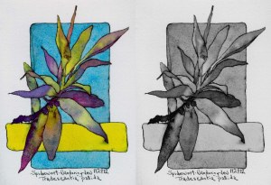
I began with a line drawing using a dip pen and “Nessie” ink. Using a limited palette of only three hues (Aureolin, Permanent Alizarin and French Ultramarine Blue) I mixed the other hues I needed to correspond with the values I wanted.  I mixed a yellow-orange, orange, yellow-green, green, and a slightly darker green moving toward blue-green.

First I painted the darkest dark, the shadows.  I let that dry completely so that I could see exactly how dark the violet shadows ended up. The second wash was the background, the yellow-orange.  These two washes define my value range, my lightest light (other than the white paper) and my darkest dark.  I then worked dark to light starting on the shadow side of the clipper and making my way around the surfaces from shadow to illuminated planes.

When I got to the clipper attachment I totally forgot what my goal was and simply played with the ink bleeding into a diluted blue-violet mix.  It is difficult to shut off my intuitive actions.

Family Treasures No.47 – Craftsman Electric Hair Clipper

I present this and other methods of painting by color value in the Color Value Workshops.

The Game is about making choices and becoming aware that choices must be made whether you like it or not. Embracing and accepting the truth behind that statement is far easier if it is presented in the form of play. Taking responsibility for making choices is far more fun when playing than when working. Learning becomes a joyful experience.

Samples of Various Grayscale Value Range Options, "Seed Packets"

Every shape is specific. It has a size and it has a value. It may or may not have a hue. That hue may be warm or cool, saturated or neutralized. Every time you make a mark, you make a decision either consciously or not.

The challenge of working in color will be more pleasurable when you understand the importance of choosing values for your shapes whether you are painting still life, landscape, portrait or abstract.  Honing your grayscale skills, combined with knowing the local value of specific colors will serve you well when standing before your canvas.  You will have strong tools to help you create the paintings you envision.

Link to The Game – Throwing to Determine Grayscale Value Range

The above samples began with a Five-Shape line drawing:

"Seed Packets", Five Shape Line Drawing used for the grayscale value range examples.

Correlating each color, in its full intensity, to a percentage of gray on the value scale is often challenging.  Often, it is a new concept for artists, especially beginning artists.

Diamond Shaped Color Value Chart

The above chart is not a perfect example of basic color value as it applies to a twelve hue color wheel, but it serves as an example of a valuable exercise in relating color hues to values.  I highly recommend taking the time to create one.  I also suggest that you use quality watercolor paper when doing this so that you don’t run into the same problems I did when laying down the washes.

The images on left and center are the chart in its first and second stage.  The image on the right is the finished chart (the one shown in the middle) converted to grayscale in my computer.  I will, in the near future, create the same chart in either acrylic or oil so as not to complicate matters with the issue of transparency and dilution of hue intensity.

Diamond color value charts: Watercolor media.

Without viridian on my palette, my greens become instantly neutralized.  Perhaps I need to clean my palette wells.

Burning the candle at both ends

Or maybe it’s simply Holiday-Wind-Down lack of attention to keeping colors clean.  The Noodler’s Nikita Red ink is festive, perfect for this holiday season.  I like the softer edges it gives to the Nespera Plant, the drafting table and the shadows cast upon the tablecloth.  When the candle became lost as a shape against the leaves, I went back into the line work with another fountain pen filled with black ink. The fabulous patterns on the candlestick holder distracted me from making good decisions for a strong pattern based on value shapes of the entire composition.

Drawn first with fountain pen followed by washes of watercolor.

Another example of mixing neutral colors using <a title="Directions and Sample Painting, Color Wheel Five for reference …

Breaking Through Morning Mist

The morning presented minimal contrast and coloring that reminded me more of the lifeless colors I’m trying to avoid mixing.  As the sun attempted to break through the layers of mist, diffused sunlight added a bit of warmth to the backyard, winter landscape.  I exaggerated the hues for my own pleasure.

I continue to refer back to Color Wheel Five to mix neutrals using only two pigments plus white, avoiding mud.  I use my nine-step grayscale to check my values.  For this morning’s painting, I wanted to use a limited value scale, avoiding sharp contrasts that would indicate stronger sunlight.

Painting Sketch:  Oil on gessoed birch wood panel 5″ x 8″

The directions for creating Color Wheel Five are now posted.

Painting using Color Wheel Five

I painted two sample paintings using Color Wheel Five looking out my studio windows this afternoon.  By laying out my paints in a circle, making sure that they are in the same order as my Color Wheel Five, it’s quite simple to mix exactly what I want, making minor changes as necessary.  It’s immediately clear when the value is right or wrong when I do a preliminary value sketch in pencil or ink prior to beginning my painting.  My colors stay clean.  As soon as I make mud I know that I’ve strayed from my color wheel.  If I find myself lost, looking for a color, I look carefully at the color choices within the proper Value Range Ring and simply pick a gorgeous color and try it!   I usually break through into a more creative use of color.

I keep my brushes clean and wipe any muddy colors off my palette so they don’t contaminate the beautiful colors.  I try to be inventive by adding extra colors from the appropriate Value Ring that may not be what I see in my landscape or object.

Sample ... straying from reality

In the painting above(sorry it’s a bit blurry), I stayed with my original sketch of shapes and values, but played with the color.  It is much livelier than the view out my window this afternoon.  I wasn’t in the mood to paint another gray day.  Using my Color Wheel, it is easy to be inventive.

Link to Directions for creating Color Wheel Five

Moving along with this color wheel of neutrals …..

Constantly correcting color mixes

As I move around the wheel it becomes clear where I have to go back and correct the mix of pigments to achieve the results I want.  My goal is to create a smooth transition from segment to segment of beautiful neutrals mixing only two colors plus white.  Both the hue and value often need correcting.  I will complete all segments before correcting again.  At this point, there are at least six segments I will alter.  The Cadmium Lemon plus purple / blue is better, but still not correct.

Color Wheel Five focuses on mixing neutrals from using complements and near complementary colors.