As much as I don’t like green and red together, I think green and rose is beautiful.

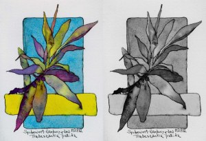
Scented Rose Geranium
This is the second little Artist Trading Card I have painted inspired by my Scented Rose Geranium. Both days I threw the die and got a Complementary Color Scheme. Link to previous painting post.
The colors work better because the red leans toward violet and the greens lean toward yellow. Rather than being the same value, as red and green are, pink and green offers more of a value range allowing the shapes to play more dynamically with one another. The value difference is subtle yet effective.
I leave in the morning to teach color workshops at Village Art Supply in Santa Rosa, CA. I hope to see some of you there! I’m giving a free demo on Thursday evening.
Sketchbook Artist Trading Card: Scented Rose Geranium No. 2 – drawn first in ink with fountain pen, followed by watercolor
Color Scheme: Complementary Color Scheme