On September 26th and 27th I’ll be teaching another Color Scheme Game/Color Value Workshops at RileyStreet Art Supply in Santa Rosa.  On September 28th and 29th I’ll teach Watercolor Techniques at the art story.  Online registration is open on my website: ChrisCarterArt.com.

Orbs No. 20 - Watercolor - 12" x 18"

Orbs No. 20 – Watercolor – 12″ x 18″

I’m looking forward to spending time with new students and traveling a bit with former students who will be sharing some of their favorite en plein air painting spots with me.  I’ll do my best to post a few of our color adventures while I’m away.

Image:  Orbs No. 20 , watercolor, 12″ x 18″, created using flea market trash as templates applying paint with a mouth atomizer.  Color Scheme: Extended Analogous.

Granted, there is only one tiny piece of paper glued onto the watercolor paper, but….. that still makes it a collage.

Orbs No. 22, Watercolor & paper, 22" x 30"

Orbs No. 22, Watercolor and tiny piece of handmade red paper, 22″ x 30″

I’m not a purest when it comes to painting.  When the painting begins to take on a personality, I nurture that personality, mood, story, whatever it might be evolving into, with anything and everything I can to make it the most that it can be.  In this case, the painting needed a tiny rectangle of red paper (1″ x 1.5″).  The final touch was the dark orb next to the piece of red paper.  Before adding those two elements, the depth of the painting was remarkably shallow.  Those two elements, one because of the color contrast and the other because of the value contrast, created the illusion of extreme, infinite space.  It helped to view a black and white version of the painting as it neared completion.  I make a habit of viewing my paintings in black and white to avoid guessing at design problems that might be resolved with only one or two strokes.

I used a combination of brush, splatter, junk templates, mouth atomizer, saran wrap, collage, scrape and comb.

Orbs. No. 22 – Watercolor and paper, 22″ x 30″, to be included in the Healing Arts exhibit at Overlook Hospital in November.

Back in the studio opening up all my leftover cans of worms…

"T" - watercolor painting 22" x 30"

“T” – watercolor painting 22″ x 30″

As wonderful as a clean and orderly studio is, it’s terribly intimidating and resistant to what I need to do in its clean and orderly space.  I dragged out six of the 22″ x 30″ watercolors I started prior to moving out of my wonderful, giant studio with natural light that flooding in through huge windows.  I had the first three layers of thrown paint on the six sheets of watercolor paper.

I’ve come a long way since I threw that paint.  My color sense has taken a severe swerve away from where it was.  What I want from a painting now is far more than I have ever wanted before.  I panicked, then started to throw paint.  This time I chose the hue and value carefully.  I varied the marks with brush, scraper and my breath…..  splatter, splat, blow, flick, drop, scrape…. let dry…. flatten….. and then begin the cycle again.  I had no expectations of having a resolved piece of work for at least a couple of days.  The world is often full of surprises!

Watercolor Painting: “T”  – 22″ x 30″ watercolor

Coming up soon!  Both The Color Scheme Game Workshop and the Color Value Workshop is being offered back to back at the National Association for Women Artists in New York City on June 18th and 19th.  Call the N.A.W.A. office to register (212) 675-1616.  Space is limited to eight students.

Raw Sienna, Cadmium Red Deep and Ultramarine Blue

Raw Sienna, Cadmium Red Deep and Ultramarine Blue

Since teaching the last workshop at N.A.W.A. I have had several personal breakthroughs with color, experimenting with more neutralized primaries and discovering gorgeous palettes.  I also attended a fabulous workshop with Don Andrews.  Again, I experienced several important breakthroughs regarding maintaining strong color when working with color value.  I’ll be sharing these breakthroughs at the upcoming workshops in New York City.

Herman's Roping Boots

Seashells, Westmoreland State Park, VA

Seashells, Westmoreland State Park, VA

Seashells No.3, Myrtle Beach, SC

Seashells No.3, Myrtle Beach, SC

Blue Crab Belly

Blue Crab Belly

Click here for more info and materials list.  Please Contact me if you have questions.

I just received a copy of the video shot during last week’s demo.  It’s long, and also pretty entertaining.

Chris Carter Demo 2013 from John Wolff on Vimeo.

Thank you Essex Water Color Club!

I’m headed back to California in April to paint the hills I have fallen in love with and to teach two workshops in Santa Rosa.

Poster for the Rileystreet Art Supply Workshop

Poster

On Thursday and Friday, April 25-26, I’m teaching the Color Scheme Game/Color Value Workshop at Village Art Supply.  On Saturday and Sunday, April 27 & 28, I’m teaching the Watercolor Techniques and Abstract Design Workshop at Rileystreet Art Supply.

You can register online on my website.  Classes are limited.  Don’t hesitate to put your name on the wait list if the class is full.

Bring The Color Scheme Game outdoors, even in the winter.

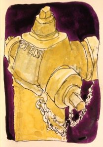
Fire Hydrant on Haywood Road, Asheville, NC

Fire Hydrant, Haywood Rd, Asheville, NC

When filming one of the videos, Twenty Steps to Better Drawing, for the upcoming series of online painting demos, I found myself beside this fire hydrant after my third round of twenty steps.  The fire hydrant wasn’t yellow.  It was a fabulous combination of bright blue, red and green.  For a quick application of color, I opted to use a limited palette with a basic color scheme of Near Complements, Yellow and Red/Violet. I wanted to make a strong statement using the extremes of color value. Reality doesn’t matter to me.

Sketchbook, en plein air sketch: Fire Hydrant on Haywood Road, Asheville, NC – drawn first in ink with a fountain pen, followed by washes of watercolor.  The sketchbook is a moleskin sketchbook with slippery paper surface.

It’s that time of year again.  Jane presents me with a beautiful poinsettia.  This one, for me, is a new variety ….. an Eckespoint Winter Rose Dark Red, featuring curly blossom petals.

Eckespoint Winter Rose Dark Red

Eckespoint Winter Rose Dark Red, Color and Grayscale Comparison

The leaves and blossoms are compact and a challenge to draw in a visually dynamic way.  I experimented by inventing space shapes between leaves and blossoms.  I’m sure before the season is over I’ll give it another try.

Sketchbook drawing:  Drawn first with dip pens using Noodler’s Tiananmen for the curly petals and Private Reserve Avocado for the leaves.  I applied clear water to allow the ink to bleed into both the petals and leaves before adding touches of watercolor.

The Complementary Color Scheme of Red and Green, a  difficult color scheme to avoid this time of year.  Converting the scan to grayscale is helpful to see how strong the graphics can be using only one hue (green leaves against green background cell) when the value of the hue is extended from light to dark.

Another example of painting by both Color Value and Color Scheme …

Klutz Juggling CubesComparing Full-Color with Grayscale Mode

Klutz Juggling Cubes
Comparing Full-Color with Grayscale Mode

Color Scheme: Analogous with Split Complements (Yellow-Green, Yellow, Yellow-Orange plus Red-Violet and Blue-Violet)

Limited Palette: Aureolin, Cadmium Lemon, Cadmium Red Light, Permanent Alizarin, French Ultramarine Blue and Manganese Blue.

Sketchbook Drawing:  Family Treasures No. 47, Klutz Juggling Cubes – drawn first with fountain pen followed by watercolor.

Autumn is a perfect time of year to focus on the illusions created by high contrast values.  Watercolor is my choice of mediums for color/value studies that will result in capturing that gorgeous glow of sunlight passing through the translucent oak leaves of yellow and orange.

Oak Leaves at 3 pm, bathed in sunlight

Neutrals of the palette strengthen the apparent brilliance of fully saturated colors, creating an even stronger illusion of sunlight passing through translucent oak leaves in the late afternoon.