Color schemes have become another fine-tuned skill in my toolbox. As with any tool, a lifetime can be spent learning new uses for tools.
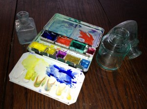
Photo of Glass Inkwells and Travel Palette
Unexpected possibilities now present themselves during my morning practice of the Color Scheme Game.
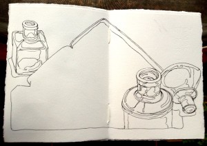
Line Drawing
Normally, I would continue the line drawing adding the pans of watercolor and the indications of the mixing wells. At this point, I stopped. There was something about the large, open shape of the palette without details that I liked. It gave contrast to the smaller shapes that describe the inkwells.
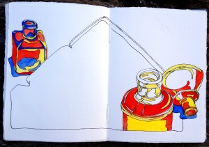
Painting in the Inkwells
I decided to throw the die and paint in only the inkwells leaving me the option of drawing the pans of pigment before painting the palette shape. I came up with the Basic Triad Color Scheme with red as one of the colors.
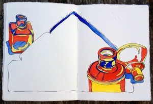
One more step
I went one step further to paint the inside lip of the travel palette. I put the drawing aside until the next morning to see if I felt the same way about it. In the middle of the night I awoke with the idea of indicating the paint in the palette as splats rather than pans of pigment.
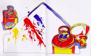
Glass Inkwells No.18 with pigment splats
I’m pleased with the results and glad that I allowed for something new to happen.
Sketchbook Drawing: Glass Inkwells No. 18, Ink and Watercolor. Drawn first with fountain pen filled with Noodler’s Black ink followed by watercolor.
Color Scheme: Basic Triad of yellow, red and blue.
Limite palette: Cadmium Yellow Pale, Cadmium Red Light, French Ultramarine Blue


