color schemes


Hollyhock color scheme game chris carter artist ink watercolor 090318 1080
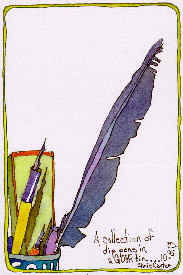
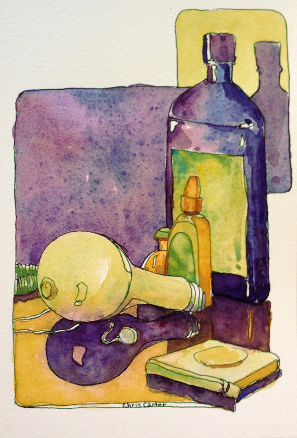
Exciting news!  The Color Scheme Game was first introduced on this blog many years ago.  At the time, I was only teaching live workshops, not having the software flexibility I wanted to teach it properly online.  To my delight, the benefits of playing the game have been shared around the world and I find myself teaching live workshops in Wales as well as in the USA. I have met fabulous artists and shared the joy of creative living and expressing life with pen and brush.

My dream of being able to share the game around the world every day and in every country has now come true.  An even more extensive version of the game is now available online at www.ExploreWithChrisCarter.com.

Just a reminder … this blog is not the blog I currently post to on a more regular basis.  I leave it online because of the wealth of information that is packed into it’s pages.  If you wish to subscribe to my current blog, please visit my website www.ChrisCarterArt.com.

P.S. – I’m now actively posting demo videos on my YouTube channel. Please visit and subscribe to my channel.  Thanks! You/Tube.com/c/chriscarterart

As you have noticed, I’m not posting very often on this blog anymore.  My schedule and my focus have shifted.  I’m spending more time traveling, teaching and painting in the studio.

Dip Pens in a Goya Tin

Dip Pens in a Goya Tin

Please remember that most of my blog posting will be done on my website blog rather than here or on my Third Time Around Blog.  Please subscribe to the website blog and/or the monthly newsletter if you want to continue to follow my adventures and musings.  Link to Website Blog …… Thanks!

Image: Dip Pens in Goya Tin, drawn first in ink with fountain pen, followed by watercolor washes, Color Scheme- Analogous with Split Complements.

On September 26th and 27th I’ll be teaching another Color Scheme Game/Color Value Workshops at RileyStreet Art Supply in Santa Rosa.  On September 28th and 29th I’ll teach Watercolor Techniques at the art story.  Online registration is open on my website: ChrisCarterArt.com.

Orbs No. 20 - Watercolor - 12" x 18"

Orbs No. 20 – Watercolor – 12″ x 18″

I’m looking forward to spending time with new students and traveling a bit with former students who will be sharing some of their favorite en plein air painting spots with me.  I’ll do my best to post a few of our color adventures while I’m away.

Image:  Orbs No. 20 , watercolor, 12″ x 18″, created using flea market trash as templates applying paint with a mouth atomizer.  Color Scheme: Extended Analogous.

The orb paintings are piling up nicely in the studio.

Orbs No. 21 - 22" x 30" Watercolor

Orbs No. 21 – 22″ x 30″ Watercolor

The series is taking on a diversity that I didn’t expect and I’m pleased with the way it is shaping up.  Orbs No. 21 has less layers than some of the others, yet the illusion of space is still strong.  I wanted the blues and greens to dominate and the tiny bits of red to create powerful dynamics without being overbearing.

I now have plenty of paintings for the Healing Arts Exhibit at the Bouras Gallery in Overlook Hospital that begins at the end of October.  I hope to have twice as many as I need so that I can pick the strongest to hang in the show.

Color Scheme:  Analogous with one complement.

Lately I have been heading straight to the studio to work on my Orb and Energy paintings.  Occasionally, I took a break and sketched a few culinary herbs.  This morning, I felt the need to sketch from my bed while sipping coffee and to throw the die for a color scheme.  Being so distracted lately, my dresser has accumulated an odd collection of objects.

Cluttered-dresser-ink-watercolor-sketchbook-drawings-chris-carter-artist-071713-web

Cluttered Dresser (4.25″ x 6.25″)

…. a bottle of lavender lotion to help me sleep at night, a small vial of patchouli oil, eye drops, ear buds, an insect repellent wristband ( works quite well!), a light bulb and a thin tape measure…..

This is where my painting energy has been going lately…..

Crack of Dawn, Orbs No. 9

Crack of Dawn, Orbs No. 9 (21″ x 14″)

And….. not that I need to be involved with another blog! Oh no!…. I’m trying to cut back on my blog time…. But, I can’t resist the invitation from an old and dear friend to put our minds together to create a blog that explores both the working of the brain and the mysteries of the Universe.  I have wanted to tap into the world of artists who love science and this is the first step to finding that community!   Of course…. I will be posting many of my orb paintings on the new blog.  I’ll keep you posted.

Cluttered Dresser: drawn first with ink using a fountain pen, followed by watercolor. Analogous with split complemens color scheme.

Crack of Dawn, Orbs No. 9: Watercolor, layered and layered and layer even more… thrown, splattered, blown, etc.

Finally!  The downloadable, PDF Version of The Color Scheme Game is now available on my website!

Color Scheme Game Kit

Color Scheme Game Kit

Die and grayscale are not included.  Print on cardstock (available at office supply stores) and laminate with clear contact paper.  Color scheme templates and custom color wheel templates make learning about color, color schemes and mixing colors with a limited palette a breeze!

Visit my Website Store for details.  Website: ChrisCarterArt.com

Directions for playing both The Color Scheme Game and the Extended Color Scheme Game are included.

Contact me if you have any problems.

20130506-152524.jpg
Joanie caught my fever for painting outdoors as well as my attraction to the infinite variety of shapes that pipes and faucets draw upon the landscape. She suggested we paint the faucet outside her laundry room.
I drew it on site and painted it when I returned to Mountain View. I used an analogous color scheme with slit complements indicated by the color scheme game.
Drawn first with ink followed by watercolor.

In the early 70’s I rented an apartment near Cleveland Circle in Boston.

Sliced-Apples-Artist-Trading-Cards-ink-Watercolor-chris-carter-artist-030613-sz-web

The kitchen was narrow with high ceilings. A large window allowed the morning sunlight to pour past the potted herbs onto the glass doors of the cupboards, the counters and the floor.  The night I painted the walls bright orange and the cupboards fire engine red, I dropped into bed with a migraine.  I thought it was from the colors I’d chosen in too small a room.  Most likely, it was from the fumes.

Next morning, I awoke to the most cheerful kitchen I’d ever experienced.  The following year, I moved to a studio/loft space where I repeated the red and orange interior decor wherever possible … the bathroom I constructed and the one wall that wasn’t brick.  The memories of those days flooded back to me while painting this morning’s drawing, a sketch of Mike’s kitchen in Mountain View last month.  I threw the die and came up with the color scheme Analogous with One Complement.  The dominant color was to be orange/yellow.  As I remembered the effect of the fire engine red paint, my orange/yellow counter top became more of a red/orange.

Artist Trading Card – Morning Sketch: Sliced Apple, drawn in ink with fountain pen, followed (weeks later) with watercolor.

As much as I don’t like green and red together, I think green and rose is beautiful.

Scented-rose-geranium-artist-trading-card-ACEO-ink-watercolor-chris-carter-artist-012413-sz

Scented Rose Geranium

This is the second little Artist Trading Card I have painted inspired by my Scented Rose Geranium.  Both  days I threw the die and got a Complementary Color Scheme.  Link to previous painting post.

The colors work better because the red leans toward violet and the greens lean toward yellow.  Rather than being the same value, as red and green are, pink and green offers more of a value range allowing the shapes to play more dynamically with one another.  The value difference is subtle yet effective.

I leave in the morning to teach color workshops at Village Art Supply in Santa Rosa, CA.  I hope to see some of you there!  I’m giving a free demo on Thursday evening.

Sketchbook Artist Trading Card: Scented Rose Geranium No. 2 – drawn first in ink with fountain pen, followed by watercolor

Color Scheme:  Complementary Color Scheme

Two beautiful, red, anjou pears jumped into my shopping cart and the grocery store.

Anjou-Pearsg-artist-trading-card-ACEO-ink-watercolor-chris-carter-artist-CRC-011813-sz

Two Anjou Pears

I played only the first part of The Color Scheme Game. I wanted the Red-Violet of the pears to be one of my colors in my color scheme.  I threw the die and ended up with a color scheme of Analogous with One Complement.  I chose red/Violet, Violet, Blue/Violet and Yellow/Green.

Sketchbook Drawing – Artist Trading Card: Drawn first in ink with fountain pen followed by watercolor.

Limited Palette  – Cadmium Lemon, French Ultramarine Blue and Crimson

Next Page »