Color Studies


Hollyhock color scheme game chris carter artist ink watercolor 090318 1080Exciting news!  The Color Scheme Game was first introduced on this blog many years ago.  At the time, I was only teaching live workshops, not having the software flexibility I wanted to teach it properly online.  To my delight, the benefits of playing the game have been shared around the world and I find myself teaching live workshops in Wales as well as in the USA. I have met fabulous artists and shared the joy of creative living and expressing life with pen and brush.

My dream of being able to share the game around the world every day and in every country has now come true.  An even more extensive version of the game is now available online at www.ExploreWithChrisCarter.com.

Just a reminder … this blog is not the blog I currently post to on a more regular basis.  I leave it online because of the wealth of information that is packed into it’s pages.  If you wish to subscribe to my current blog, please visit my website www.ChrisCarterArt.com.

P.S. – I’m now actively posting demo videos on my YouTube channel. Please visit and subscribe to my channel.  Thanks! You/Tube.com/c/chriscarterart

A new way to explore when traveling…. or even at home…. Nine Squared Walk’n’Draw!

The results of the Walk'N'Draw

The results of the Walk’N’Draw

It was time for me to make up a new game to play.  I’m now working on Design and Temperature.  In Susan Abbott’s workshop earlier this year, she emphasized the order of priorities when painting….. First comes Shapes, then Values, then Temperature and lastly, Color.  With that in mind, I used the concept of my video “Twenty Steps” to create the new game I’ve titled Nine Squared.

Basic Materials to walk with

Basic Materials to walk with

Before the walk, I drew a grid of nine rectangles on nine sheets of watercolor paper.  All I needed to bring with me were the sheets of paper, a mechanical pencil, a waterbrush, a mini Altoid tin with warm and cool pigment (I only needed two pans, not all three that are shown above) and my leather folder that I use as an easy-to-hold drawing surface that doubles as a folder to carry the paper.

Pencil sketch not shown

Pencil sketch not shown

I begin the walk, taking Nine times Nine steps in any direction (Eighty one steps).  I stop, choose a composition, snap a photo and start my timer for nine minutes.  In those nine minutes I determine my shapes and repeat them in two more rectangles.  I leave one as the pencil drawing, paint the second as a value sketch in browns and the third as a temperature sketch in warm and cool pigment.

Like any of my games, I allow myself to break the rules on a regular basis.  I do not stop in the middle of a busy street just because I’ve reach step number eighty-one.  If there is a nice place to sit in the shade and I reach it at step seventy-three, I stop and sit down.  If I need twelve more steps to get to a nice shady spot, I take those extra steps.  The rules are simply a guide to force me to be more observant of every spot I pass through and to determine warms and cools to create stronger design.

Images:  small en plein air watercolor sketches in Mountain View, California

On September 26th and 27th I’ll be teaching another Color Scheme Game/Color Value Workshops at RileyStreet Art Supply in Santa Rosa.  On September 28th and 29th I’ll teach Watercolor Techniques at the art story.  Online registration is open on my website: ChrisCarterArt.com.

Orbs No. 20 - Watercolor - 12" x 18"

Orbs No. 20 – Watercolor – 12″ x 18″

I’m looking forward to spending time with new students and traveling a bit with former students who will be sharing some of their favorite en plein air painting spots with me.  I’ll do my best to post a few of our color adventures while I’m away.

Image:  Orbs No. 20 , watercolor, 12″ x 18″, created using flea market trash as templates applying paint with a mouth atomizer.  Color Scheme: Extended Analogous.

Granted, there is only one tiny piece of paper glued onto the watercolor paper, but….. that still makes it a collage.

Orbs No. 22, Watercolor & paper, 22" x 30"

Orbs No. 22, Watercolor and tiny piece of handmade red paper, 22″ x 30″

I’m not a purest when it comes to painting.  When the painting begins to take on a personality, I nurture that personality, mood, story, whatever it might be evolving into, with anything and everything I can to make it the most that it can be.  In this case, the painting needed a tiny rectangle of red paper (1″ x 1.5″).  The final touch was the dark orb next to the piece of red paper.  Before adding those two elements, the depth of the painting was remarkably shallow.  Those two elements, one because of the color contrast and the other because of the value contrast, created the illusion of extreme, infinite space.  It helped to view a black and white version of the painting as it neared completion.  I make a habit of viewing my paintings in black and white to avoid guessing at design problems that might be resolved with only one or two strokes.

I used a combination of brush, splatter, junk templates, mouth atomizer, saran wrap, collage, scrape and comb.

Orbs. No. 22 – Watercolor and paper, 22″ x 30″, to be included in the Healing Arts exhibit at Overlook Hospital in November.

Finally!  The downloadable, PDF Version of The Color Scheme Game is now available on my website!

Color Scheme Game Kit

Color Scheme Game Kit

Die and grayscale are not included.  Print on cardstock (available at office supply stores) and laminate with clear contact paper.  Color scheme templates and custom color wheel templates make learning about color, color schemes and mixing colors with a limited palette a breeze!

Visit my Website Store for details.  Website: ChrisCarterArt.com

Directions for playing both The Color Scheme Game and the Extended Color Scheme Game are included.

Contact me if you have any problems.

(1. ) Matted, framed and dropped off paintings for solo exhibit at Connexions Gallery in Easton, PA …. done  (2.) Picked up paintings from exhibit in Brooklyn … one sold! …. done (3.) Figure out how to film, edit and post short art videos for my students …. still a long way to go to get better, but done.  The list goes on.  Fortunately, all but a few items on the current Art Business list are checked off.  Today the list will grow again, but last night I felt the pressure was off.  I laugh when people envy my life as an artist thinking that I have all the time in the world to do exactly what I want to do.  My life as an artist definitely is enviable, but not for that reason.
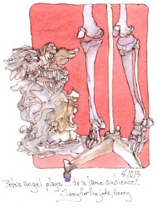
Pete's Angel playing to a lame audience

Pete’s Angel playing to a lame audience

What might be envied is the joy of curling up in a comfy chair, a warm breeze crossing the room, the sound of gentle rain with an occasional flash of lightning, fountain pen in hand, drawing two of my constant companions, the little garden angel given to me by my friend, Pete, and my skeleton, Henry.  They keep each other company beside the fireplace in the living room.

Why post this random though on Creative Color?  Because I am still exploring the beauty of the neutrals I can achieve with that ugly pigment, Cadmium Red Deep!  I began my intense study of color three, almost four years ago so that I could bring more full intensity, highly saturated color into my paintings.  That mission has been accomplished and I am enjoying full intensity hues more than I imagined possible.  Now I am going deeper into the world of beautiful color and playing with neutrals.  Without realizing it, most of my daily sketchbook paintings, though rich in color and value, do not use any of the three pigments in full intensity.  All of the colors applied to the drawing are mixes of all three primary pigments in my limited palette of raw sienna, cadmium red deep and ultramarine blue.  This is my third week exploring this palette and I like it more each day.  Though I’m excited about whatever my next three primaries might be, I can’t seem to leave this palette behind.

Image:  Drawn first in ink with fountain pen, followed by watercolor.

For those of you who live within driving distance of Santa Rosa, California …. I will be teaching workshops at both Village Art Supply (April 25th & 26th) and Riley Street Art Supply (April 27th & 28th)  Please contact me if you would like more info!

Link to short art videos:  Vimeo.com/ChrisCarterArt/

Link to Website Blog: ChrisCarterArt.com/blog/

While preparing for the recent watercolor demonstrations I’ve been doing, I cut open the tube of Cadmium Red Deep that I never use.  I don’t use it because I think it is as ugly as Cadmium Red Light is beautiful.  After making the Color Scheme Game color wheel using Cad Red Deep as my primary red, I discovered the potential of beauty within that color I deemed as ugly.

No. 1 - Artist Trading Card - Watercolor

No. 1  – Watercolor – 2.5″ x 3.5″

This limited palette of raw sienna, cadmium red deep and ultramarine blue produces lovely neutrals.  The watercolor demos are over for the next two months, but I continue to use this odd palette.  In fact, I have replaced a dozen of the paintings I originally planned to hang in the upcoming solo exhibit at Connexions Gallery with new paintings created with this palette.  I can’t help but be reminded of the story The Ugly Duckling.

Raw Sienna, Cadmium Red Deep and Ultramarine Blue

Raw Sienna, Cadmium Red Deep and Ultramarine Blue

In the early 70’s I rented an apartment near Cleveland Circle in Boston.

Sliced-Apples-Artist-Trading-Cards-ink-Watercolor-chris-carter-artist-030613-sz-web

The kitchen was narrow with high ceilings. A large window allowed the morning sunlight to pour past the potted herbs onto the glass doors of the cupboards, the counters and the floor.  The night I painted the walls bright orange and the cupboards fire engine red, I dropped into bed with a migraine.  I thought it was from the colors I’d chosen in too small a room.  Most likely, it was from the fumes.

Next morning, I awoke to the most cheerful kitchen I’d ever experienced.  The following year, I moved to a studio/loft space where I repeated the red and orange interior decor wherever possible … the bathroom I constructed and the one wall that wasn’t brick.  The memories of those days flooded back to me while painting this morning’s drawing, a sketch of Mike’s kitchen in Mountain View last month.  I threw the die and came up with the color scheme Analogous with One Complement.  The dominant color was to be orange/yellow.  As I remembered the effect of the fire engine red paint, my orange/yellow counter top became more of a red/orange.

Artist Trading Card – Morning Sketch: Sliced Apple, drawn in ink with fountain pen, followed (weeks later) with watercolor.

Blue sky lay hidden behind the cover of clouds as we headed to Pacifica.

Pacifica, California, en plein air

Pacifica, California, en plein air

The sun made bold attempts to break through the clouds, the neutralized colors enhanced by the silver light.

Pacifica, California, en plein air

Pacifica, California, en plein air

Finally ….. the landscape transformed as the cloud cover cleared and the water reflected the blue of the sky.

Sun Dancing on the Sea

Sun Dancing on the Sea

Sketchbook Paintings: Artist Trading Cards (2.5″ x 3.5″) en plein air, Pacifica, California

Top – Ink and watercolor

Middle and Bottom – watercolor

The hills surrounding Santa Rosa feel like kindred spirits.

Sugarloaf Ridge State Park, Kenwood, California

Sugarloaf Ridge State Park, Kenwood, California

Live oaks and black oaks, solitary and in clusters,  populate the erratic hillsides declaring their uniqueness and beauty.  The winter colors are rich with muted blue/greens and red/violets, so different from the winter colors of New Jersey.

Sugarloaf Ridge State Park, Kenwood, CA – watercolor on Rives BFK printmaking paper.  Limited palette: Winsor Yellow, Yellow Ochre, Cerulean Blue, French Ultramarine Blue, Carmine.

Next Page »